31 Best Sherwin Williams Trim Colors for a Bright and Cheerful Breakfast Nook with Lemonade!
That narrow strip of paint around your windows, doors, baseboards, and ceiling might seem like a minor detail—but don’t underestimate it. Trim paint does way more than just finish the edges. In the right shade, it can completely transform the energy of your breakfast nook.
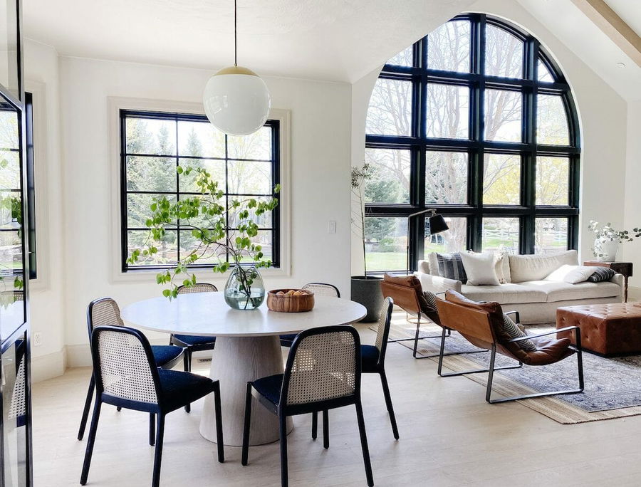
Think of trim as the frame that brings the whole picture into focus. It adds contrast, defines architectural details, and enhances the natural light in your space. Whether you’re sipping coffee while the morning sun streams in or enjoying a quiet lunch break, the right trim color makes your kitchen nook feel welcoming, polished, and full of personality.
:max_bytes(150000):strip_icc()/DesignbyEmilyHendersonDesignPhotographerbyZekeRuelas_30-505526a0c8b64765a16e3533b2cdadd3-18358daf0ffb4d09a7149c52dbe7c01a.jpeg)
And when it comes to choosing the perfect trim color, Sherwin Williams makes it easy. Their range of designer-approved, high-quality paints includes plenty of gorgeous trim shades—from clean whites to warm neutrals and even soft, mood-boosting pastels. Whether your vibe is farmhouse cozy, cottage chic, or modern minimalist, there’s a trim color that will bring your nook to life.
Why the Trim Color Matters in a Breakfast Nook
The trim may seem like a small detail, but it plays a huge role in shaping how your space feels.
Here’s why your trim color matters:
- Frames the space: Trim outlines windows, doors, baseboards, and ceilings, helping define the room.
- Boosts brightness: A well-chosen light color reflects sunlight and instantly makes a room feel more open.
- Adds character: From classic white to buttery cream, trim colors can make a subtle or bold style statement.
- Ties the palette together: Trim acts as the bridge between your walls, furniture, and accessories.
Whether you want crisp contrast or soft harmony, these trim colors can pull your look together beautifully.
31 Best Sherwin Williams Trim Colors for a Sunny Breakfast Nook
:max_bytes(150000):strip_icc()/DburnsIndianAve-12-c2945814caa24004ab7fd45a3c37fc7b.jpeg)
Each of these Sherwin Williams paint colors brings its own fresh charm to the table (pun intended). Let’s dive in:
Classic Bright Whites
1. Extra White (SW 7006)
Bright, clean, and perfect for modern or minimalist nooks. Reflects light beautifully.
2. Pure White (SW 7005)
A balanced, neutral white that works well with both cool and warm tones.
3. High Reflective White (SW 7757)
The brightest white in Sherwin Williams’ lineup. Ideal for high-contrast looks.
4. Snowbound (SW 7004)
Soft white with slight greige undertones. Great for Scandinavian or farmhouse vibes.
5. Alabaster (SW 7008)
A warm white with creamy softness—cozy and inviting for relaxed mornings.
6. Greek Villa (SW 7551)
Elegant and slightly warmer than Alabaster. Beautiful for cottage-style spaces.
Creamy & Soft Neutrals
7. Dover White (SW 6385)
Warm and buttery without feeling yellow. Excellent with warm-toned wood furniture.
8. Creamy (SW 7012)
As its name suggests—soft, inviting, and smooth. Adds a touch of vintage charm.
9. Shoji White (SW 7042)
A warm off-white with beige undertones. Ideal for transitional décor.
10. Antique White (SW 6119)
Traditional, timeless, and comforting. Adds a lived-in elegance to your nook.
11. Navajo White (SW 6126)
Classic and subtle with an earthy warmth that feels very natural.
Muted Grays & Greige
12. Agreeable Gray (SW 7029)
A go-to greige that feels fresh and modern. Works especially well in light-filled rooms.
13. Repose Gray (SW 7015)
Slightly cooler than Agreeable Gray—pairs well with white walls and natural textures.
14. Drift of Mist (SW 9166)
A whisper of gray with an airy softness. Perfect if you want a very subtle touch.
15. Mindful Gray (SW 7016)
Slightly deeper for contrast with white walls but still soft enough for trim.
Warm Pastels for a Playful Feel

16. Lemon Meringue (SW 7561)
Light and sunny—like a spoonful of citrus sorbet. Brightens up small spaces.
17. White Raisin (SW 7685)
A golden cream shade with personality. Makes a charming statement.
18. Nonchalant White (SW 6067)
Barely-there yellow-beige that feels relaxed and warm.
19. Romance (SW 6323)
A soft blush-pink trim can be unexpected and totally delightful.
20. White Dogwood (SW 6315)
A blush white that’s subtle but full of character. Lovely in vintage-inspired nooks.
Fresh Greens & Earthy Tones
21. Sea Salt (SW 6204)
A pale green-gray that brings coastal calm energy into your breakfast space.
22. Window Pane (SW 6210)
Fresh and minty—great for a breezy, cheerful nook.
23. Opaline (SW 6189)
A very pale green with just enough pigment to feel refreshing.
24. Contented (SW 6191)
A muted sage green that adds an earthy, organic touch.
Cozy Beige & Taupe Neutrals
25. Accessible Beige (SW 7036)
A soft, warm beige that pairs beautifully with both pastels and woods.
26. Balanced Beige (SW 7037)
More taupe than beige—offers subtle depth without overpowering the room.
27. Natural Linen (SW 9109)
A sandy neutral that brings in that cozy, beachy energy.
Soft Blues & Gentle Lavenders

28. Rain (SW 6219)
A cool blue-gray that feels peaceful and sophisticated.
29. Sleepy Blue (SW 6225)
Light and whimsical, like a morning sky.
30. North Star (SW 6246)
A soft silvery blue that’s fresh and breezy.
31. Silver Peony (SW 6547)
A pale lavender with just a hint of shimmer. Unexpected but calming.
Pro Tips for Choosing the Right Trim Color
Still deciding? Use these expert tips to help narrow it down:
- Test your paint: Always sample your top 2–3 colors in the actual room lighting before committing.
- Match undertones: Look at your wall color’s undertone (warm, cool, or neutral) and match or complement it with your trim.
- Gloss level matters: Semi-gloss or satin finishes work best for trim—they’re durable and reflect more light.
- Think about contrast: Want a clean, sharp look? Go for a brighter trim. Prefer a softer, seamless feel? Choose a cream or light beige close to your wall color.
- Don’t skip the ceiling: Pairing your trim with a coordinating ceiling color (usually white or off-white) ties everything together.
Advanced Styling Ideas for a Cheerful Breakfast Nook

- Layered whites: Use different shades of white on walls, trim, and ceiling for a crisp yet cozy all-white palette.
- Add lemony accessories: Complement warm trim tones with yellow decor—think cushions, napkins, or a lemon vase centerpiece.
- Contrast with wallpaper: Pair creamy trim with floral or botanical wallpaper for a cottage-core vibe.
- Use color-blocking: Paint lower wall panels or wainscoting in a soft pastel and trim in a crisp white for contrast.
- Bring in greenery: Natural plants and herbs on the windowsill enhance any trim color and add freshness.
FAQs About Trim Colors in Breakfast Nooks
Q: Should trim always be white?
A: Not at all! While white is classic, warm neutrals or soft pastels can add character without overwhelming the space.
Q: What’s the best finish for trim?
A: Semi-gloss is the most popular for trim—it’s easy to clean and reflects light well. Satin is a good alternative for a more subtle sheen.
Q: Can I paint my trim the same color as the walls?
A: Yes! This monochromatic look creates a seamless, modern feel—especially in small or minimalist spaces.
Q: How do I keep my white trim from looking dingy?
A: Choose a white with the right undertone and enough brightness. Pure White and Extra White are great options that stay crisp over time.
Q: What trim colors go best with yellow or citrus-themed décor?
A: Creamy whites, soft greens like Sea Salt, or warm beiges like Accessible Beige work beautifully with citrus accents.
Conclusion: Let Your Trim Set the Mood
A cheerful breakfast nook starts with great lighting, cozy textures, and—most importantly—the perfect trim color. Whether you want classic white, a soft pastel, or a bold-but-subtle neutral, Sherwin Williams offers tons of beautiful options to help you brighten your mornings.
From bright whites like Extra White to creamy tones like Dover White and playful pastels like Lemon Meringue, your trim can set the tone for the whole day. Add in a few fresh lemons, a comfy chair, and a sunny window—and you’ve got a nook worth waking up for.
